
The Food Safety Chick
Transformed a cluttered food safety brand into a modern, credible, and digitally scalable system, showcasing versatility across all media.
Services
Brand Identity System,
Logo Redesign
Client
TFSC
Year
2025

.jpeg)
The Food Safety Chick (TFSC) is a science-based brand dedicated to providing practical, expert food safety guidance to professionals and home cooks. The project scope was a complete brand identity and logo redesign in 2025. The core objective was to transform the existing look—which was cluttered, highly illustrative, and used inconsistent typography—into a modern, trustworthy, and scalable digital brand. The goal was to establish a professional presence that reflected the high quality of the educational content. The successful outcome is a minimalist, iconic logo and a versatile brand system that immediately elevates TFSC's credibility across all platforms, from merchandise to mobile UI.
The original TFSC logo presented a significant challenge: it was highly artistic but lacked the functional clarity necessary for a digital-first brand focused on science and safety. The inconsistency led to issues like the accidental deployment of a temporary holiday graphic as the main logo, which undermined trust. The redesign was significant because it required distilling a complex idea (food safety education delivered by a personality) into a single, highly efficient visual element. By merging the chick silhouette with the thermometer icon, the final logo became a single, memorable touchpoint that speaks to both expertise and approachability, giving the brand the professional foundation required for future growth and client acquisition. interest.

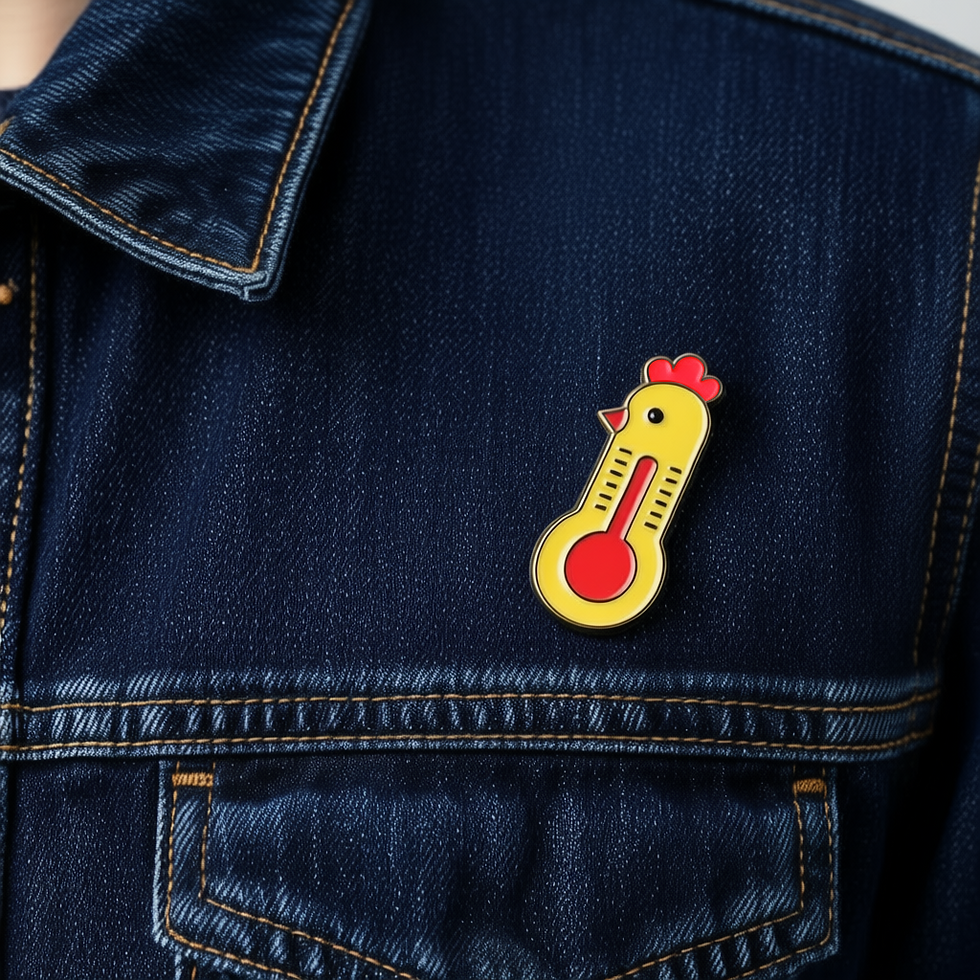


Versatility and Implementation
A hallmark of good UI/UX design is ensuring consistency and legibility across all possible screen sizes and physical touchpoints. This redesigned logo was rigorously tested for its ability to scale. The bold, simple linework allows the mark to function perfectly as an enamel pin and a crisp embroidery on the trucker cap two high-visibility merchandise items. Furthermore, applying the mark to the notebooks and the website mockup (as seen in the apron detail) ensures that the brand's identity is seamlessly integrated into both physical products and the core digital experience. This holistic approach guarantees that every interaction a user has with The Food Safety Chick reinforces the brand's new message of professionalism, clarity, and safety excellence.


