
Mira
Developed a vibrant, highly visual brand identity for a modern tea beverage and demonstrate mastery in executing photo-realistic packaging mockups and visual asset creation.
Services
Identity & branding, Digital
Client
Mira
Year
2025
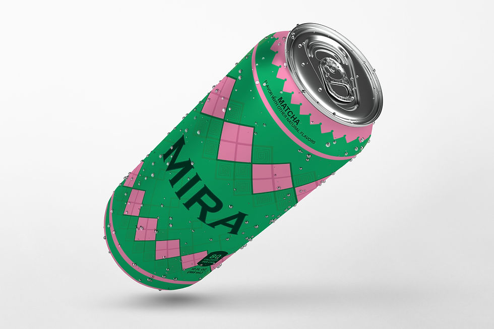
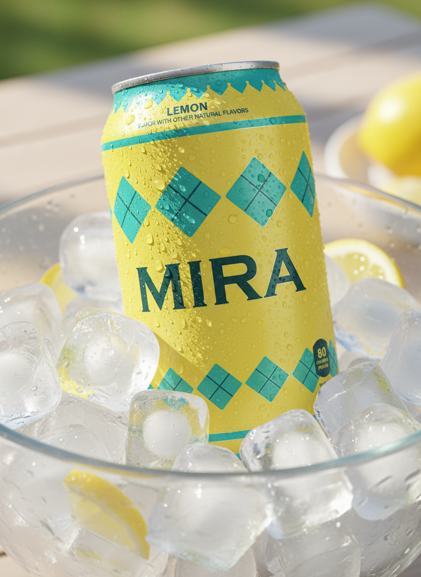
This project was a self-initiated exploration focused on applying geometric illustration and bold color theory to a modern tea brand. The primary goal was to create a clean, minimalist, and approachable identity for multiple flavor applications (Matcha, Lemon, etc.). The scope included: primary packaging design (can), a 4-pack caddy, merchandising (T-shirt), and out-of-home advertising (truck wrap, billboard).
The MIRA project began with the strategic goal of developing a beverage brand that immediately communicates modernity, refreshment, and a playful spirit. Our visual foundation was built on a bold juxtaposition: a clean, deep green primary color was paired with a vibrant, energetic pink/yellow palette. The core design utilized hand-drawn geometric illustrations to create a unique texture that wraps the can, ensuring the product is visually distinct and highly recognizable on the shelf. This approach successfully established an approachable brand identity.

%20conflict.jpg)


Execution & Visual Impact
A significant focus of this project was demonstrating execution excellence across various media. I leveraged advanced 3D modeling and rendering techniques to create photo-realistic mockups of the primary can packaging, ensuring every detail, from condensation drops to material finish, was perfected. Beyond the product itself, the brand identity was seamlessly scaled to a range of assets, including out-of-home advertising (billboards and truck wraps) and merchandising, proving the system's scalability and robust nature for a real-world product launch.
The design system was built to accommodate multiple flavor profiles (Lemon, Matcha) while maintaining immediate brand recognition. By establishing a clear pattern and applying controlled, strategic color swaps, MIRA successfully presented itself as a cohesive product line. The resulting aesthetic is one of high visual impact and clarity, directly achieving the objective of creating a fresh, appealing brand that captivates consumers and stands out in a crowded market space.


